Alliance | Visual Identity
New logo for an iconic New Jersey pest control brand.
New visual identity for a leader in New Jersey pest control.
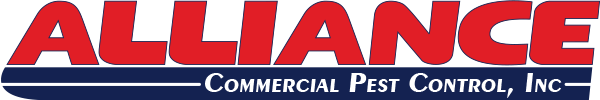
This is the original Alliance logo which had been in use since the company was founded in 1983. Classic and understated. In 2012, I was tasked with modernizing the logo.
When presented with this project, I instantly knew where I wanted to take the Alliance identity: focus on the existing Alliance type. The most unique aspect of the original logo was the lettering of the 'Alliance' name. I knew that I wanted to update that iconic lettering a bit by making every letter the exact same height to help it really own itself.
The company has never been solely a commercial pest services company and it wanted to make that point clear by rebranding itself as "Alliance Pest Services". Simplifying the message was important, and I wanted that to really show in the new logo. What came to mind instantly was something simple: a retro-inspired look would fit this brand perfectly.
One of the problems with retro logos can be the feeling of being forced. I wanted to avoid that if at all possible. Thankfully, as you'll see below with the finished product, I believe the new logo fits this brand while feeling natural.
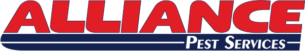
The finished product. Simple, yet iconic. Nicely balanced and wide open, yet effectively creates a perceived sense of togetherness compared to the original logo.
Another thing I wanted to do was to create a sense of togetherness that the original logo didn't have. The inherent italic styling of the Alliance type gave me the idea to create a false border that could mimic the effect of the border that existed before, without having anything actually bind the elements together. To accomplish this, I chose to create a skewed blue rectangle underneath "Alliance" which would emcompass the right-justified phrase "Pest Services."
The rectangle didn't initially work as planned since it was plain and didn't do anything for the logo at all. Also, having a simple rectangle looked abrasive, so I chose to round out the left side to create a seemless flow from the letter 'A' down to it - creating what I call a "cirtangle." Yet that exposed another issue: the right-justified "Pest Services" inside of it was an eyesore.
After trying a few other things, I chose to create a line down the horizontal middle of the cirtangle to break up the gap, while also pushing the "Pest Services" to the left a little. That was the final key to getting the finished logo you see above.
Not a terribly complex logo, but it's super-effective and ultimately well done. Even something this seemingly simple takes a ton of thought. Everyone at Alliance was happy with it.
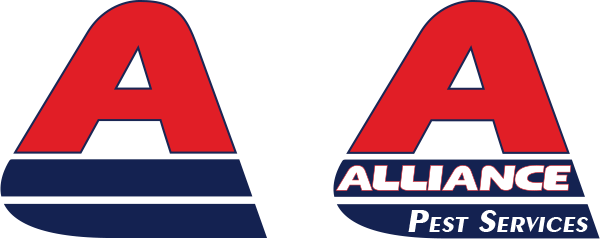
Alternate shortened versions made for social media profiles.
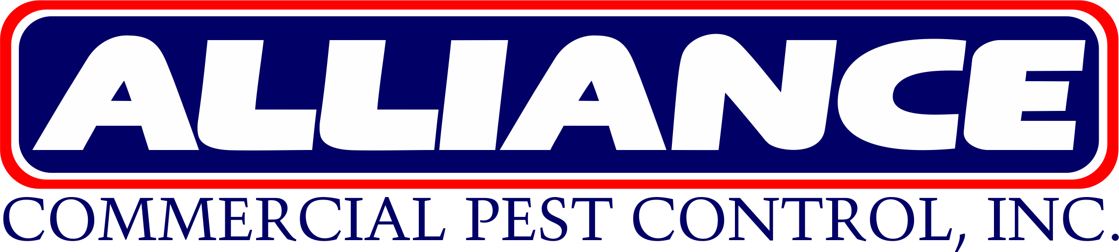
Below is an updated version, using the original company title. Turns out, after making and presenting the new logo, they decided to not rebrand the company. All was good, as it only took minor tweaking to adjust.