Emerald Support Services | Visual Identity
Visual identity for a startup virtual assistance and social media management company.
I was contacted by Erin K. Schenke to create a logo for her new business Emerald Support Services, a virtual assistance and social media management company. The request was simple enough: she wanted a logo that was an expression of who she is. After a brief information gathering session with her, I was ready to create the logo. I already had an idea, but did some research on the virtual assistant market to gauge what was out there and how I could bring a higher standard of quality to this new business so it could stand out from the crowd.
I explain the process below.

The original concept. The three squares on top are three individual concepts, not meant to be viewed as one whole piece.
My initial approach was to quickly put out a concept of a logo I had envisioned to gauge interest in where I was planning on heading. The idea was simple enough: create a gem-like logomark, and create a powerful wordmark to go along with it. I started with just a square, played with the colors (green was an obvious choice - the shade wasn't), and tried a few ways to accent the square. Ultimately, I came up with 15 versions of the 'gem'.
The client was expectedly lukewarm to the original concept, but she liked the direction - which was the intent.
Taking the direction of the logo to a more production-ready point.
I softened up the square by rounding the corners and going with a final, flat color. I also included another set of rounded squares inside the large square to create a clover-like effect, but it also served the purpose of creating a sense of perspective like a gem off-kilter. The client is of Irish American descent, which is a source of personal pride, and that information made it a no-brainer to go with the Irish-inspired theme.
I also added a lowercased serif font for 'Emerald' and an uppercase 'Support Services' in a similar - but not identical - serif font.
This version was recieved well, but I felt it still needed something.

Getting closer.
With this concept, something so simple as adding another rounded square within the clover was the key to finalizing the intended sense of perspective. Also, the progression of colors from light-to-dark added more impact to the clover, as well as the overall gem.

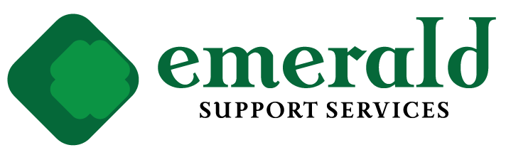
Finalized logo.
White background.
Despite the favorable gem in the previous concept, something was still not right. Changing the 'Support Services' to a sans-serif font did the trick. Aligning it beneath the middle of the emerald (perfectly under 'meral') increased it's impactfulness greatly. Also, I shaved the top serifs of the L and D a little to create a pleasing, unique aesthetic.
The client loved the outcome and was extremely pleased. This was the approved final version of the logo.
Next comes the variations.

Finalized logo.
Black background, lighter green used for 'Emerald'.
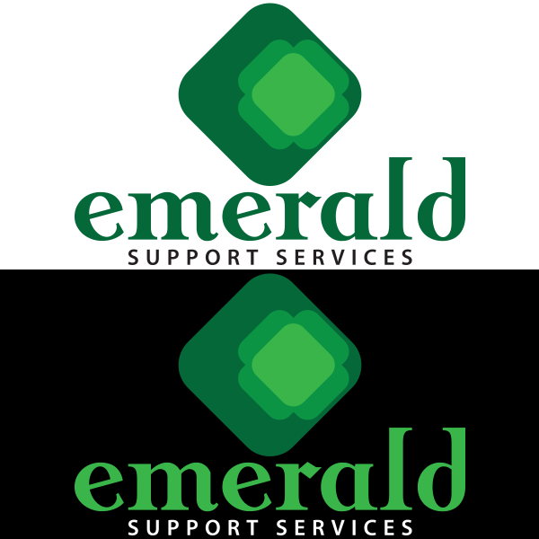
Finalized logo.
Variations created for use where it makes better sense to have the gem on top.
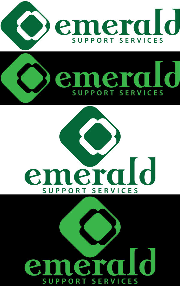
Finalized logo.
Single-color version with clover cut-out for use with single-color print processes (i.e., vinyl stickers, t-shirts).
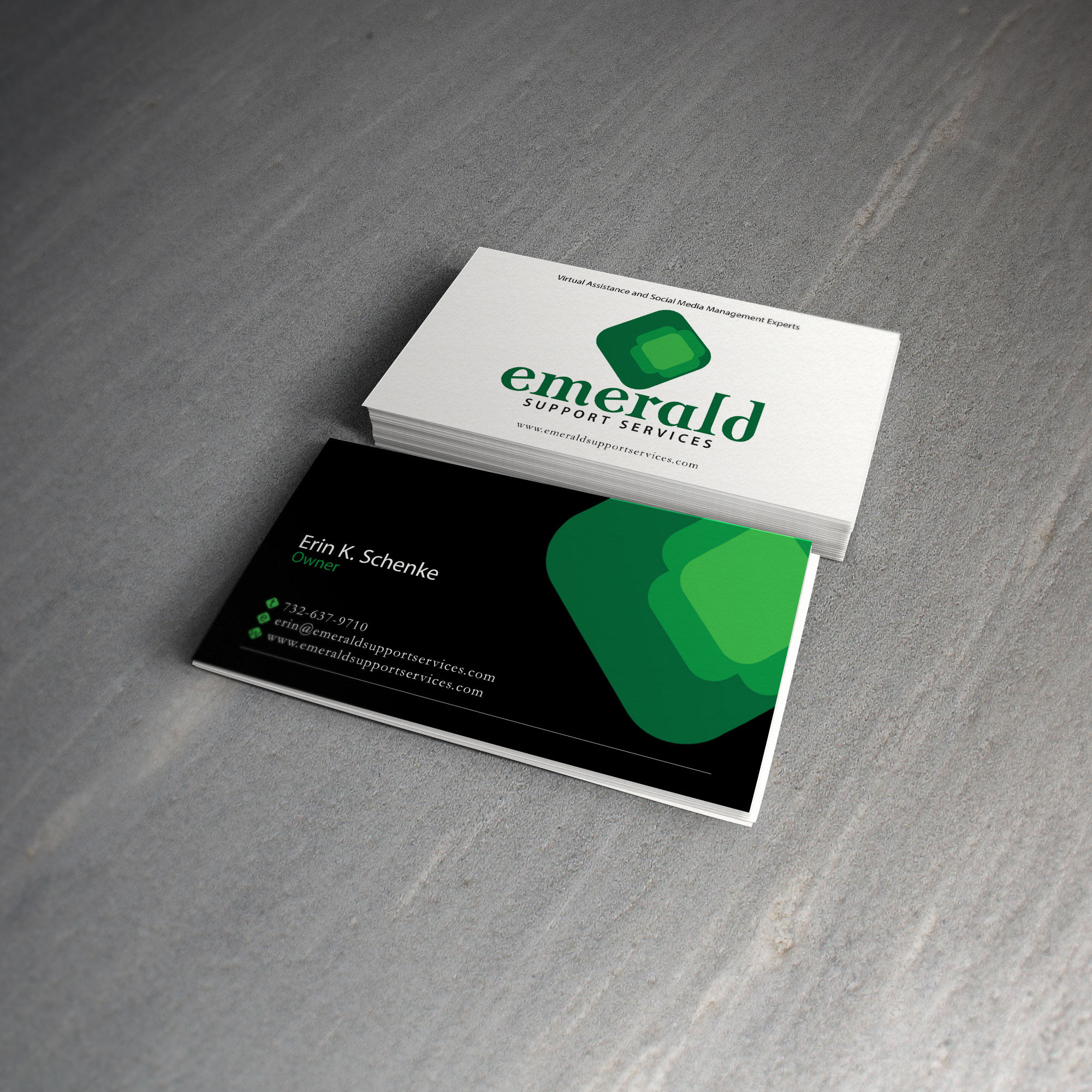
Finalized business cards.

Single-color concept for vinyl sticker for a window.